
 Brand referenceSource standards opens in a new tab
Internal brand reference
Provisio
Brand Style Guide
Standards for clear, accessible, and consistent materials—from everyday documentation to digital assets and presentations.

Logo compliance
Use current approved files. Horizontal and stacked formats have equal standing within each color treatment; choose the orientation that fits the space.
Primary · full color
White or Light Green surfaces.
Secondary · tri-color


Navy surfaces.
Tertiary · all white


One-color use on contrast-safe dark surfaces.
Clear space and prohibited use
Protect clear space
Digital: at least the height of the logo symbol on every side. Print: at least one inch. Keep copy, images, icons, and other logos outside this area.
Do not alter the logo
No recoloring, distortion, rotation, outlines, effects, rearrangement, or full-color logos on dark/busy images.
Required legal identification
Use “Provisio Partners LLC” only as plain text where formal legal identification is required: SOWs, contracts, billing blocks, and signature lines. This does not authorize retired visual logos.
Typography and quotes
Poppins
Titles 700 · headings 600 · body 400.
Use sentence case and the role-specific sizes below.
Optional reading exception
Proxima Nova is approved for long-form P1/P2 and editorial quotes, captions, and attribution. It requires brand-approved licensed files or a font service. None are configured here; all text on this page renders in Poppins.
Title, heading, and paragraph specifications
| Role | Web desktop px | Mobile px | Weight | Letter spacing | Line height | Deck px | Print pt |
|---|---|---|---|---|---|---|---|
| Title | 40–56; 60 at ≥1500px | 40 | 700 | −0.02em | 1.12 | 52 | 32 |
| Subtitle | 22 | 20 | 600 | −0.01em | 1.6 | 26 | 16 |
| H1 | 40 | 36 | 600 | −0.02em | 1.18 | 48 | 26 |
| H2 | 34 | 30 | 600 | −0.015em | 1.25 | 40 | 24 |
| H3 | 28 | 26 | 600 | −0.015em | 1.25 | 36 | 20 |
| H4 | 24 | 22 | 600 | −0.015em | 1.3 | 30 | 18 |
| H5 | 20 | 18 | 600 | −0.015em | 1.3 | 26 | 16 |
| H6 | 18 | 16 | 600 | −0.015em | 1.35 | 22 | 14 |
| P1 | 18 | 18 | 400 | 0 | 1.6 | 24 | 13 |
| P2 | 16 | 16 | 400 | 0 | 1.6 | 22 | 12 |
| P3 | 14 | 14 | 400 | 0 | 1.5 | 20 | 11 minimum |
Tablet Title is 40px. Minimum web copy is 14px; print is 11pt. Deck values apply to a 1280 × 720 canvas—not point sizes. Use 700 for circle numerals and brief inline emphasis; keep numerals navy, not green.
Functional text roles
| Role | Web size | Weight | Letter spacing | Line height |
|---|---|---|---|---|
| Eyebrow | 14px | 600 | +0.1em | 1.3 |
| Table header | 14px | 600 | 0 | 1.3 |
| UI label | 14px | 500 | 0 | 1.5 |
| Accent note | 14px | 400 | 0 | 1.6 |
| Button | 16px | 500 | 0 | 1.4 |
| Gradient subheading / context | 14px | 600 | 0 | 1.5 |
| Library introduction | 16px | 500 | 0 | 1.6 |
Content-card headings are 24px; feature headings are 28px. Supporting lines are 18px/500, distinct from 22px lead subtitles. Table headers are sentence case at 600—not all caps.
Letter spacing, line height, and reading measure
Letter spacing
The distance between letters. Negative values tighten spacing; do not tighten titles beyond −0.02em or use 800/900 weights. Proxima Nova exceptions use normal spacing.
Line height
The vertical distance between lines. A value of 1.6 equals font size × 1.6. Use 1.6 for P1/P2, 1.5 for P3 and quotes, and a reading measure no wider than 70ch.
Quote containers and attribution
These are internal styling examples, not client testimonials. Production quotes require verified wording and accurate attribution.
Light and dark quote treatments — internal examples
“Start with the mission, then align the technology.”
“Start with the mission, then align the technology.”
Quote typography and format specifications
| Role | Web (CSS px) | Deck (canvas px) | Print (pt) |
|---|---|---|---|
| Quote | 24px desktop / 20px mobile / Medium 500 | 32–36 / 400 | 14 / 400 |
| Surface label | 14px / 400; understated | — | — |
| Source / name | 14px / 500 | 22 / 600 | 12 / 600 |
| Role / context | 14px / 400 | 20 / 500 | 11 / 500 |
| Shared type rule | Poppins; normal style, no italics; letter spacing 0; line height 1.5 | Letter spacing 0; line height 1.5 | Letter spacing 0; line height 1.5 |
| Treatment | Specification |
|---|---|
| Light | #222222 quote on #F8F9FA; source and label #133F69; context #3B5067. 1px #E2E6EA border; 4px #ADBD37 left spine; 12px radius; Level 2 shadow. |
| Dark | Solid #133F69; #FEFEFE quote, source, context, and label. Same 4px decorative spine and 12px radius; Level 2 shadow. |
| Web padding / gaps | 32px desktop / 24px mobile. Label → quote 16px; quote → attribution 20px; source → context 4px. |
| White backgrounds; Charcoal quote; no shadows. Minimum context size 11pt. | |
| Semantic content | Live HTML blockquote/cite. Label internal styling examples explicitly. Verify quote and attribution before use; no invented testimonials, results, or client relationships. |
| Photos | Clean surfaces are the default. Bounded photos require a strong Navy scrim or opaque copy plate, actual-crop contrast checks, and verified permissions. Do not treat a soft tint as a legibility guarantee. |
Color palette
The complete approved palette. Choose each color by its assigned role; reserve Salesforce Blue and Sky for Salesforce-specific content.
Deep Sea Blue
Headings, navigation, and functional icons
Dark Azure
Body copy on light surfaces
White
Canvas and text on dark surfaces
Surface Gray
Neutral panels and content surfaces
Light Green
Light surfaces and eyebrow washes
Dark Green
Primary actions and meaningful status
Charcoal
Long-form documentation and quotes
Component Border
1px component boundaries
Light Grey
Thin structural dividers
Light Yellow Green
Decorative spines and indicators—not text
Light Blue
Decorative secondary blue
Provisio Green
Large graphic accents only—not headings or buttons
Muted Aqua
Decorative spines, connectors, and localized washes
Aqua Mist
Community panels and navy icon pods
Deep Teal
Community blend and bounded dark surfaces
Salesforce Blue
Decorative accents in Salesforce content only
Salesforce Sky
Salesforce surfaces with navy text and icons
Text color use and compliance
| Role | Color | Application |
|---|---|---|
| Titles, H1–H6, navigation, icons | #133F69 | Navy by default. On dark surfaces, use White. |
| Body / supporting labels | #3B5067 | Body 400; supporting labels 500 on light surfaces. |
| Long-form text / quotes | #222222 | Use on White or Surface Gray. |
| Short emphasis / numbers | #133F69 | Use 600 for short emphasis; brief bold emphasis may use 700. |
| Action / status labels | #6B7600 | 600, only on White or Surface Gray; not paragraph emphasis. |
| Dark-surface text / emphasis | #FEFEFE | White text and links; verify contrast on the actual surface. |
Salesforce and decorative colors
Reserve #00A1E0 and #80D4F3 for Salesforce-specific content. Salesforce Blue is decorative; use navy functional icons and text on Sky or White. Light Yellow Green is for spines and decorative indicators; Light Green is a surface or eyebrow wash. Use the gradient reference for approved surface recipes. Aqua supports general community and connection imagery; it does not replace primary Navy or Green or imply a Salesforce association.
Backgrounds and gradients
Use clean solid surfaces for most content. Apply gradients selectively to bounded panels; keep copy opaque and buttons solid. Never use images as full backgrounds.
White
Default page, email, documentation, and print surface.
Surface Gray
Content grouping, light quotes, and secondary panels.
Light Green / Aqua Mist
Bounded accent panels; Aqua Mist (#E7F4F3) is an approved alternative. Use navy or Dark Azure copy.
Deep Sea Blue
Statement panels and dark quote containers; use White text and links.
Nine approved recipes. Apply translucent gradients over an opaque White base; keep buttons solid and text opaque.
Approved gradient recipes — nine treatments
Warm mesh
Light sections.
CSS recipe — Warm mesh
background-color: #FEFEFE;
background-image: radial-gradient(ellipse at 85% 15%, #E4EAB1 0%, #F8F9FA 60%, #FEFEFE 100%);Sage sweep
Light sections.
CSS recipe — Sage sweep
background-color: #FEFEFE;
background-image: linear-gradient(135deg, #FEFEFE 0%, #F8F9FA 55%, #E4EAB1 100%);Neutral fade
Content panels.
CSS recipe — Neutral fade
background-color: #FEFEFE;
background-image: linear-gradient(180deg, #FEFEFE 0%, #F8F9FA 45%, #E2E6EA 100%);Navy depth
Statement sections.
CSS recipe — Navy depth
background-color: #FEFEFE;
background-image: linear-gradient(135deg, #133F69 0%, #3B5067 100%);Mission blend
Statement sections; keep normal copy in the navy-dominant area.
CSS recipe — Mission blend
background-color: #FEFEFE;
background-image: linear-gradient(135deg, #133F69 0%, #133F69 55%, #3B5067 70%, #6B7600 100%);Salesforce edge wash
Salesforce-specific content only.
CSS recipe — Salesforce edge wash
background-color: #FEFEFE;
background-image: radial-gradient(ellipse at 100% 12%, rgba(0,161,224,.12) 0%, rgba(0,161,224,.04) 35%, #FEFEFE 70%);Navy edge wash
General light sections.
CSS recipe — Navy edge wash
background-color: #FEFEFE;
background-image: linear-gradient(135deg, #FEFEFE 0%, #FEFEFE 60%, rgba(19,63,105,.10) 100%);Aqua edge wash
Localized community/program/connection surfaces; keep most of the section white.
CSS recipe — Aqua edge wash
background-color: #FEFEFE;
background-image: linear-gradient(135deg, #FEFEFE 0%, #FEFEFE 65%, rgba(112,199,195,.12) 100%);Community blend
Intentional statement panels, section covers, and bounded graphic surfaces—not a default content background.
CSS recipe — Community blend
background-color: #FEFEFE;
background-image: linear-gradient(90deg, #133F69 0%, #245E5A 50%, #6B7600 100%);Keep 60–70% of light sections visually white. Localized bold-color washes: 8–12% opacity. Solid accent borders: 3–4px. Do not fade an entire section or use gradient text.
| Role | Specification / limits |
|---|---|
| Aqua / Mist / Teal | Aqua #70C7C3 is decorative on light surfaces; Aqua Mist #E7F4F3 supports small panels with Navy / Dark Azure copy; Deep Teal #245E5A is the Community blend stop. Green and Navy remain primary action colors. |
| Controls / text | No small Aqua text, White text on Aqua, Aqua primary buttons or links, gradient buttons, status recoloring, or logo edits. Keep text opaque and controls solid. |
| Recorded contrast | Navy on Mist 9.59:1; Dark Azure on Mist 7.37:1; Navy on Aqua 5.48:1. Aqua on White 1.96:1—decorative only. White on Community blend: minimum sampled 4.94:1; verify the final rendered treatment. |
| Salesforce distinction | #00A1E0 and #80D4F3 remain Salesforce-context colors; Aqua is general-brand decoration, not Salesforce branding. |
| Community / photos | Use the blend as a bounded CSS graphic, not a default content background or photo overlay. Reference photos stay unchanged in a bounded img at 100% opacity; verify permissions. |
Design elements and production
Two content-container presets. Pills are controls or compact accents—not a third long-content container.
Content and feature containers — live examples and specifications
Content card
A single reading block.
White or Gray surface, left-aligned copy, 24px padding, and a 12px radius. Body copy stays at 16px, regular weight, with a 1.6 line height.
Review approved color rolesFeature container
A header and body in separate blocks.
20px radius, 28px per block, and White body with Dark Azure text. The Navy header keeps all copy White.
Review logo clear spaceCompact shape swatch: exactly 112 × 52px, 50px pill radius, Level 3. Not the multi-block Feature container.
| Specification | Content card | Feature container |
|---|---|---|
| Radius / border | 12px / 1px #E2E6EA | 20px / 1px #E2E6EA |
| Shadow | Level 2: 0 4px 8px rgba(0,0,0,.16) | Level 3: 0 8px 16px rgba(0,0,0,.20) |
| Padding | 24px desktop / 20px mobile | 28px per block / 20px mobile |
| Color blocking | White / Gray; optional 4px #ADBD37 top spine | Navy or Mission blend header + White text; White body + Dark Azure text |
| Heading | 24px / 600 / −0.015em / 1.25 | 28px / 600 / −0.015em / 1.25 |
| Supporting line | 16–18px / 500 / −0.01em | 18px / 500 / −0.01em |
| Body | 16px / 400 / #3B5067 / 1.6 | 16px / 400 / #3B5067 / 1.6 |
| Internal gaps | 12px label → heading → copy | 12px label → heading → subtitle |
| Controls / print | Inputs 6px; buttons/tags 50px. No shadows in print/SOW/legal layouts. | 112 × 52px compact pill is a separate accent/control. No shadows in print/SOW/legal layouts. |
Buttons, states, and inputs — working controls
Local interaction only: actions update this sample’s review count. No data is sent or persisted. Hover, press, and Tab through controls to inspect their states.
Input radius: 6px. Your note stays in this component until reset or navigation.
| Variant / state | Exact production rule |
|---|---|
| Primary | One main action per group; solid #6B7600 fill / #FEFEFE text; 50px radius; Level 2 shadow. |
| Secondary | White fill; 1px #133F69 border; Navy text; no resting shadow. Gray hover surface. |
| Tertiary | Transparent fill; Navy text; no border/shadow. Neutral hover surface; underline label on hover. Use actual underlined anchors within prose. |
| Inverse | White fill / Navy text on solid Navy or verified dark surface. White focus outline outside control. |
| Default dimensions | Poppins 500 / 16px / normal letter spacing / 1.4 line height. Minimum 48px height; 14px vertical × 22px horizontal padding; 8px icon gap. |
| Compact / icon-only | Compact: ≥44px height, 14px / 500, 10px × 18px padding; dense toolbars only. Icon-only: ≥44 × 44px target, 20px icon, accessible action label; never an unlabeled primary conversion action. |
| Hover / pressed | Solid fills remain. Primary hover: 0 6px 12px rgba(0,0,0,.20). Pressed removes elevation without shifting layout. |
| Keyboard focus | 2px Navy outline, 3px offset on light; White outline on dark. Never hover-dependent. |
| Disabled | Native disabled; #E2E6EA fill; Dark Azure text; no shadow. Block activation and explain why when useful. |
| Loading | Keep label/dimensions; small spinner, descriptive loading label, aria-busy, duplicate-action prevention, completion announcement, and reduced-motion support. |
| Semantics / restrictions | Buttons perform actions; anchors navigate. No gradient fills, Aqua primary actions, extra decorative shadows, or all-caps labels. Deck/PDF links retain destinations; print labels/short URLs remain readable, without shadows. |
Elevation — Levels 0, 1, 2, and 3
| Level | CSS box-shadow | Use |
|---|---|---|
| 0 | none | Flat surfaces; all print / SOW / legal layouts |
| 1 | 0 1px 2px rgba(0,0,0,.08) | Subtle separation; not the Content preset |
| 2 | 0 4px 8px rgba(0,0,0,.16) | Content cards, quotes, and specified status tags |
| 3 | 0 8px 16px rgba(0,0,0,.20) | Feature containers and compact Feature shape swatch |
Current Level 2 (.16) and Level 3 (.20) production values supersede historical examples. Print removes every shadow.
Supplementary motifs — one lead treatment at a time
White pill, 1px border, Navy text, Dark Green status dot, Level 2. Wording—not the dot alone—communicates status.
| Element | Specification / limits |
|---|---|
| Eyebrow highlighter | 9px wash, 6px left offset behind lower label. Light: #E4EAB1 / Navy text. Dark: Navy wash / White text. |
| Eyebrow alternatives | #8FA5BD at 20% over White, or #F8F9FA, with Navy text. Optional eyebrow-only underline: 40% label width, 2px stroke, 5px below. No decorative headline underlines. |
| Architectural dots | White / Light Blue, 6–8% opacity, 24px grid, Navy surfaces only. |
| Connection rings | Cropped concentric Navy curves; 2px stroke / 20% opacity. |
| Connection paths | Four open S-curves: three Navy at 2.5px / 40%; one #ADBD37 lead at 3.5px / 90%. |
| Accent spine | 4px #ADBD37; decorative, not a substitute for a functional boundary. |
| Aqua Mist icon pod | 44px circular #E7F4F3 pod; 20–24px Navy symbol with rounded 2px outline. Navy / Dark Azure accompanying text; no small Aqua text or White text on Aqua. |
| Aqua spine | 3–4px muted Aqua #70C7C3 decorative spine; not a state indicator or functional boundary. Never a replacement for primary Green / Navy buttons or links. |
| Dark-edge Aqua curves | 2px #70C7C3 connection curves at the perimeter of solid Navy, away from copy and logo clear space. One lead motif at a time; no glow, pattern stacking, or photo overlays. |
| Placement | Keep line motifs at perimeter, away from text and logo clear space. No text crossing motifs, pattern stacking, glow, or decorative motion. Status dots are not eyebrow markers. |
Icons and arrows — size, color, and direction
| Role | Specification |
|---|---|
| Icon geometry | Rounded outline, 2px stroke, round caps/joins. Standard 20–24px; controls 16px; optional circular pod 44px. Connected circles or rounded functional symbols; no flags, sharp nodes, or logo replicas. |
| General / status | Navy on White / Gray / Light Green; White on verified dark. Action/status: #6B7600 on White, or White inside green fills. |
| Salesforce context | Navy symbols on #80D4F3 or opaque White. #00A1E0, #8FA5BD, and #ADBD37 are decorative—not small functional icons on White. This is a Provisio production rule, not a claim about Salesforce standards. |
| Upward-right geometry | Rounded 2px outline, 45° direction. 16–20px beside links; 20–24px in controls; 32–48px standalone bounded graphic. 8px label gap; ≥24px clear space around standalone arrows. |
| Arrow meaning | Right arrow for functional forward actions. Up-right for external destinations or restrained decorative progress; never expand. Navy on light, White on dark and solid Dark Green actions. |
| Restrictions / access | Do not attach arrows to every heading, alter logos, add glow, or force motion. Decorative arrows are aria-hidden; announce new-tab behavior only for actual new-tab destinations. |
Layout, text links, and accessibility
Use the correct units for each format. Middle space is the gap between columns—not additional outer margins.
Web, deck, and print — layout production matrix
| Rule | Web | Deck | |
|---|---|---|---|
| Units / canvas | CSS px; 4px base spacing scale | Canvas px, not points; 1280 × 720 | Points for type; inches for margins |
| Shell / margins | 1440px maximum border-box incl. gutters; centered auto margins | 13.333 × 7.5in deck | 0.75in on all sides |
| Side gutters / safe inset | 32px desktop; 24px at ≤800px; 20px at ≤600px | 48px on every side (0.5in) | Logo clear space independent: 1in |
| Section vertical padding | 72px desktop/tablet; 48px mobile | Keep within safe inset | 24pt internal live-section padding |
| Column / major pair gap | 32px desktop; 24px tablet/mobile; text-heavy pairs stack at ≤800px | 32px middle column gap | 0.25in multi-column gap |
| Card grid gap | 24px desktop/tablet; 16px mobile | Use canvas spacing within safe inset | Use print column gap |
| Hero / live sample gap | 48px desktop; 32px tablet; 24px mobile | Keep within safe inset | Use print layout, not web pixels |
| Example family gap | 48px desktop/tablet; 32px mobile | Keep within safe inset | Use print layout |
| Heading block → content | 32px desktop/tablet; 24px mobile | Keep within safe inset | Use print layout |
| Content / Feature padding | 24px / 28px per block; both 20px mobile | Preserve hierarchy in canvas units | No shadows |
| Quote padding | 32px desktop / 24px mobile | Preserve text-role hierarchy | Use print layout |
| Inside containers | 12px label → heading → support; 16px paragraph/action gap | Preserve text-role hierarchy | Minimum type 11pt |
| Quote gaps | 20px quote → attribution; 4px source → context | Quote line height 1.5 | Quote line height 1.5; White background |
| Reading / overflow | ≤70ch; minmax(0,1fr) tracks; min-width:0 children; local table scrolling | All content within 48px safe inset | Reflow tables; no clipped content |
| Topic boundaries | 1px #E2E6EA; header divider 24px below header / 16px mobile; subtopic gaps 24px | Clean hierarchy; no decorative headline underlines | Clear hierarchy; no decorative shadows |
| Links | ≥14px; real destinations, underlined inline links | ≥20 canvas px; keep real hyperlinks | ≥11pt; PDF links remain clickable; useful short URL on paper |
| Status / export | Explicit wording/icon, not color alone | Legacy explorations are not current production templates | Print / SOW / legal: no shadows |
Text links — live light and dark examples with state rules
Light surface
Use the logo reference and clear-space rules before placing a mark.
Review approved color roles for text and controls.
Dark surface
Use the logo reference and clear-space rules before placing a mark.
Review approved color roles for text and controls.
| Rule | Light | Dark |
|---|---|---|
| Typography | Poppins 500; inherited paragraph size/line height; normal letter spacing | Same; minimum 14px web |
| Default | #133F69 on White, #F8F9FA, or approved light surface | #FEFEFE |
| Hover | #6B7600 only on White / #F8F9FA; Navy on Light Green | #FEFEFE; never Green |
| Visited / active | Visited #3B5067; active #133F69 | #FEFEFE for both |
| Underline | Always 1px, 3px offset; 2px on hover | Same |
| Keyboard focus | Visible 2px currentColor outline, 3px offset | Same, White outline |
| Meaning | Descriptive destinations; visited color is not a read/completion indicator | No hover-dependent meaning; status uses explicit labels/icons |
These links navigate within the guide; they do not open a new tab. External/new-tab links may have a 16–20px up-right arrow with an 8px gap. Hide decorative arrows from assistive technology and announce “opens in new tab” only when true. Never nest a link inside a button.
Accessibility and production checks
- Contrast: at least 4.5:1 for normal text, 3:1 for large text and essential non-text controls. Test final colors, surfaces, images, and responsive crops—not a token in isolation.
- Keyboard: visible 2px focus with 3px offset; operable disclosures, links, inputs, and actions; minimum 48px default button / 44px compact and icon-only targets.
- Semantics: meaningful heading order, native details/summary, labeled inputs, table headers/captions, blockquote/cite, meaningful image alt text, and live HTML copy.
- State: pair color with wording or icons. Native disabled controls block actions. Loading uses aria-busy, prevents duplicates, and announces completion.
- Motion: respect prefers-reduced-motion. No decorative motif motion; remove nonessential transitions and spinner rotation when requested.
- Type: use Poppins only; minimum 14px on web.
- Export: retain real hyperlinks in deck/PDF; use readable short URLs where useful on paper. Apply print units and 0.75in margins; remove shadows in print/SOW/legal.
- Integrity: only current approved logo files; no logo recoloring or effects. Verify quote attribution and photo permissions; label illustrative interfaces/data; never invent client relationships or outcomes.
Production downloads and AI instructions
Share the current approved standards with designers and AI tools; legacy slide explorations are not production templates.
AI imagery and export instructions
Include
Authentic community connection, natural daylight, candid documentary style, real people and family moments, modern public-sector team collaboration. Prompt for the human outcome or care program.
Exclude
3D floating icons, glowing holograms, staged corporate high-fives, generic cartoon-people hype, and dated technology art. No invented testimonials, results, or client relationships.
Sources and status
Brand standards spreadsheet opens in a new tab and the supplied Provisio production design specification, revised November 2026. Current production tables define the typography. Aqua, Aqua Mist, Deep Teal, and the Community blend are approved parts of the palette and visual system. Licensed Proxima Nova is not configured. No legacy exploration slides are included as current templates.
Photography and imagery
Use candid people and program imagery. Select images for their connection to service delivery—not to signal generic technology or business activity.
Do · four approved examples

Community connection
Real people and family moments.

Support in context
Care and programming made visible.
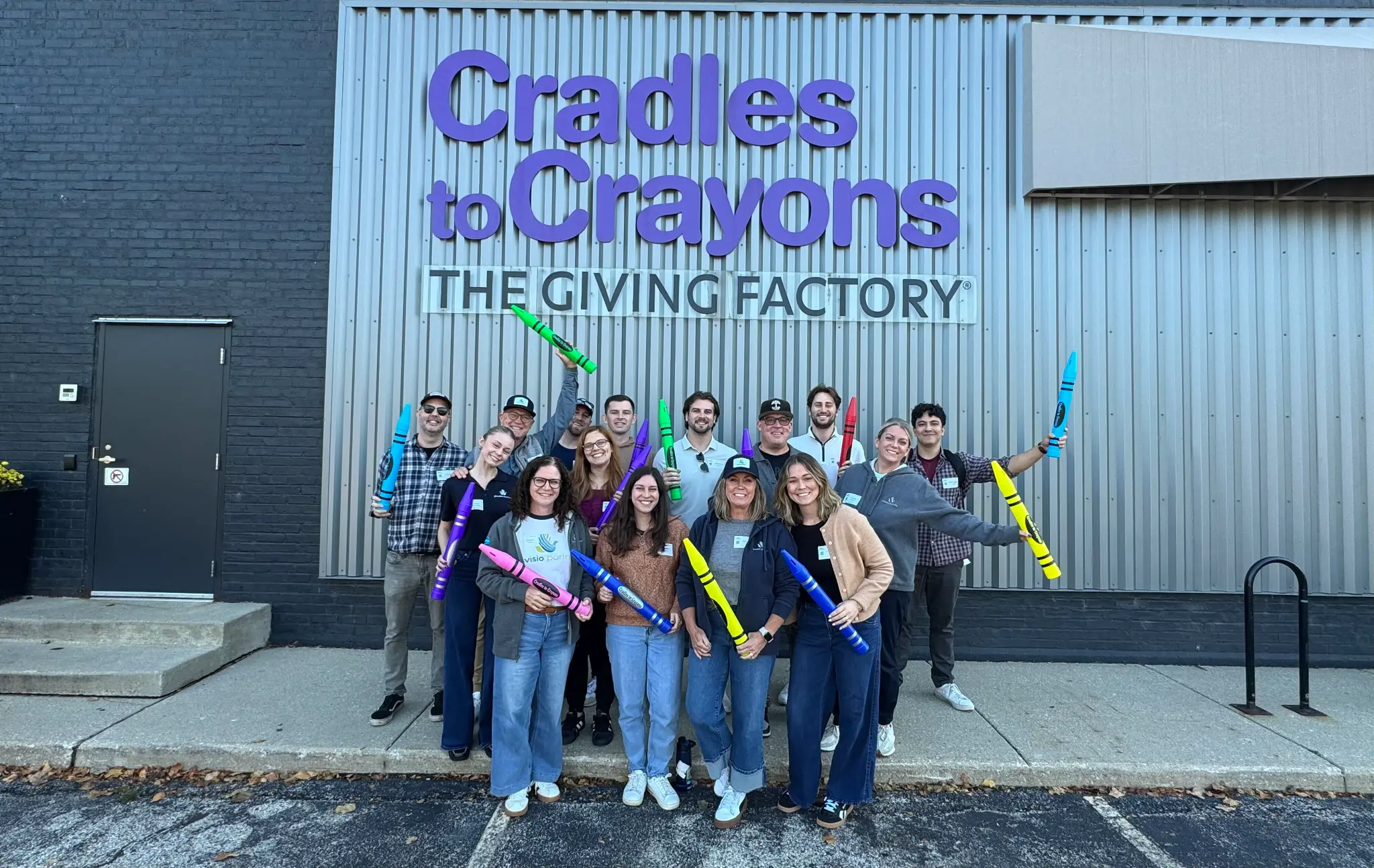
Team in community
Authentic team and partner activity.

Solution in context
Show how case management supports staff and coordinated services. Treat sample interface data as illustrative.
Don’t · four examples to avoid

AI-heavy cartoons
Generic hype without service context.

Dated digital art
Decorative tech styling without a message.

Staged corporate stock
Overly posed office scenes.

Busy technology art
Visual noise without a program connection.
Photography, overlays, and copy zones
Bounded photos by default
Keep images at 100% opacity in semantic image elements. Put dense copy on solid surfaces and protect faces and essential program action. Confirm permission, rights, and accurate context.
Safe type over photography
Use a separate tested navy scrim or opaque navy/white copy plate. A soft tint alone is not sufficient. Verify 4.5:1 normal-text and 3:1 large-text contrast at every crop and breakpoint.
| Treatment | Production rule |
|---|---|
| Header scrim | Navy 94% at left, 88% at 45%, 48% at 70%, 20% at right. Keep White copy in the first 45%; mobile moves copy to an opaque navy panel beneath the photo. |
| Caption scrim | linear-gradient(180deg, rgba(19,63,105,.20) 0%, rgba(19,63,105,.85) 60%, rgba(19,63,105,.90) 100%). White captions in the bottom dark zone only. |
| Quote plate | 92%-opaque navy plate or tested bottom scrim; keep accurate attribution and verified crop contrast. |
| Photo placement | Keep photographs in bounded image containers. Never use images as full-page or section backgrounds. Preserve safe copy insets and separate copy from dense photographic detail. |
No vivid-green or bright-blue photo overlays. Use live HTML text—not baked-in captions. Label illustrative interfaces/data and explain the operational benefit of product visuals. Never invent results or client relationships.
Brand language
Trusted partner and strategic advisor—not a vendor. Lead with strategy, shared outcomes, and the communities our work supports.
Positioning
Provisio works with health and human services nonprofits and government agencies to solve organizational challenges that affect sustainability and service delivery. We help teams make informed technology decisions, activate data, implement Salesforce, and create solutions that fit their unique programs, people, and processes.
Strategic lens
Start with the why: mission, desired outcomes, real-world challenges, and who is being served. Align technology to purpose before putting it into practice.
Mission alignment
Ask: How does this help them serve their community better? Connect decisions and systems to mission delivery, stronger outcomes, and the people doing the work.
Advisory-first approach
Strategic planning is part of every technology engagement. Work as a long-term partner through guidance, alignment, and shared ownership of outcomes—supporting immediate needs and future growth.
Our tone
Empathetic, grounded, quietly confident, approachable, thoughtful, and clear. Speak like real people with practical knowledge of human services. Let experience and insight—not volume—establish authority.
Salesforce positioning and expertise
Salesforce is a platform in service of the mission—not the starting point or the outcome itself.
Salesforce technology
Begin with mission, program needs, and operating realities. Advise on the capabilities, configuration, and change plan that fit—then implement and customize Salesforce to support those needs.
Company and ecosystem
Bring client priorities and practical outcomes into Salesforce conversations. Work with the company and ecosystem when it serves the organization’s needs; make informed recommendations, not product pitches.
Our expertise
Strategy, solution design, implementation, configuration, customization, data activation, reporting, integration coordination, adoption, and change management. Connect each decision to staff experience, program operations, and community outcomes.
Writing guidelines
Write for health and human services professionals. Keep the language direct, specific, and connected to the work.
Clear, mission-aligned language
- Mission and outcomes
Name the program, need, desired outcome, and community served before describing a solution.
- Programs and services
Use specific terms: case management, care coordination, behavioral health, housing stability, workforce development, and community health.
- People and practice
Explain how a decision supports staff, partners, and community members in daily work.
- Decisions and delivery
State the strategy, roles, timing, required inputs, and next steps in practical language.
- Evidence and scope
Be specific about what is known, what is changing, and what the work will—and will not—address.
Jargon and unsupported claims
- Technology jargon
Define SaaS, tech stack, digital transformation, and end-to-end only when necessary. Avoid tech-bro language.
- Unspecified claims
Explain the use, limitation, decision, and community benefit when mentioning AI, innovation, disruption, or automation.
- Broad promotion
Avoid seamless, scalable, best-in-class, and game-changing unless a specific, supportable claim is explained.
- Tool-first framing
Start with the organizational challenge and intended outcome—not a platform or feature.
- Abstract language
Replace optimize, leverage, and transformation with the actual action, decision, or change.